Serverless vs Containers vs VMs: Real Trade-offs in 2026
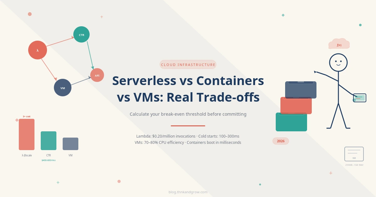
Serverless isn't always cheaper, containers aren't always portable enough, and VMs aren't dead — the…
Serverless isn't always cheaper, containers aren't always portable enough, and VMs aren't dead — the…
