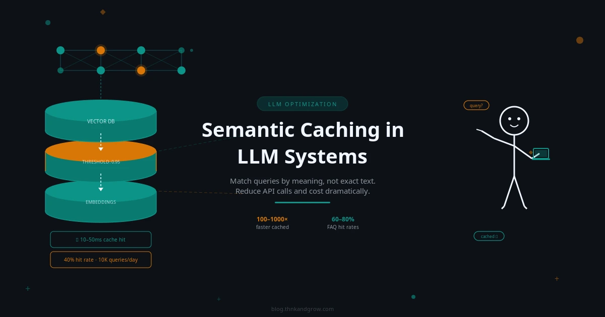
The Ultimate Guide to Image Rendering in ReactJS: Performance, SEO, and Best Practices (2025)
Overview: The Critical Role of Images in Modern Web Development
Images are fundamental to web experiences, accounting for approximately 50% of a typical webpage’s total size. How you choose to render these assets significantly impacts user experience, page performance, and search engine rankings. As web technologies evolve, developers have multiple options for implementing images in React applications, each with distinct advantages and considerations.

Comprehensive Comparison of Image Rendering Techniques
Before diving into each method, here’s a comparison table highlighting the key differences between the major image rendering approaches:
Rendering Method | Performance | SEO Impact | Browser Support | Animation Support | Best For | Memory Usage |
---|---|---|---|---|---|---|
HTML <img> tag | Good | Excellent (with proper alt tags) | Universal | Limited | Content images | Moderate |
CSS Background Images | Very good | Poor (not indexable) | Universal | Good with CSS | Decorative elements | Low |
CSS Pseudo-elements | Very good | None | Universal | Limited | UI elements | Very low |
SVG | Excellent | Good | Universal | Excellent | Vector graphics, icons | Very low |
Canvas | Moderate | None | Modern browsers | Excellent | Dynamic graphics, games | High |
WebGL | Intensive | None | Modern browsers | Excellent | 3D graphics, effects | Very high |
Image Component Libraries | Very good | Excellent | Depends on library | Varies | Responsive images | Low to moderate |
Base64 Encoding | Mixed | Good | Universal | Same as image type | Small UI elements | Increases HTML size |
Picture Element | Very good | Excellent | Modern browsers | Limited | Art direction, responsive images | Moderate |
Now, let’s explore each approach in detail.
1. Standard HTML <img>
Tag in React
Introduction
The most straightforward approach to rendering images in React is using the standard HTML <img>
element. This method is familiar to most developers and provides excellent browser compatibility.
Implementation Example
function ProfileImage({ user }) {
return (
<img
src={user.avatarUrl}
alt={`${user.name}'s profile picture`}
width="200"
height="200"
loading="lazy"
onError={(e) => {
e.target.src = '/default-avatar.png';
e.target.onerror = null;
}}
/>
);
}
Advantages
- Excellent SEO: Search engines can index and understand images with proper alt text
- Simple implementation and familiarity
- Direct browser caching
- Native lazy loading support
Disadvantages
- Limited control over rendering process
- Can cause layout shifts if dimensions aren’t specified
- Default eager loading can slow initial page load
Best Use Cases
- Content images that need to be indexed by search engines
- When accessibility is a priority
- When you need the image to be printable
SEO Impact
Very high. The alt
attribute is crucial for both accessibility and SEO, allowing search engines to understand image content.
Tips & Edge Cases
- Always include width and height attributes to prevent Cumulative Layout Shift (CLS)
- Implement error handling to handle missing images
- Use the
loading="lazy"
attribute for images below the fold - Consider using
srcset
for responsive images
2. CSS Background Images
Introduction
CSS background images provide more styling flexibility and are ideal for decorative elements where the image doesn’t convey important content information.
Implementation Example
function HeroSection() {
return (
<div
className="hero-container"
style={{
backgroundImage: 'url(/hero-image.jpg)',
backgroundSize: 'cover',
backgroundPosition: 'center',
height: '500px',
width: '100%'
}}
>
<h1>Welcome to Our Platform</h1>
</div>
);
}
Advantages
- Greater styling control (positioning, sizing, tiling)
- Simplified responsive design with CSS media queries
- No impact on document flow
- Can use multiple background images on a single element
Disadvantages
- Not accessible to screen readers
- Poor SEO as search engines can’t index these images properly
- No native lazy loading support
Best Use Cases
- Decorative backgrounds
- UI elements that don’t convey meaning
- When image manipulation via CSS is needed
SEO Impact
Low. Search engines typically don’t associate background images with page content.
Tips & Edge Cases
- Implement custom lazy loading for background images
- Use media queries to serve different background images based on screen size
- Consider using modern CSS properties like
object-fit
andobject-position
for more control
3. Canvas Rendering
Introduction
The HTML5 Canvas API provides a drawing surface for rendering graphics, images, and animations programmatically using JavaScript.
Implementation Example
import { useRef, useEffect } from 'react';
function CanvasImage({ src, width, height, effects = {} }) {
const canvasRef = useRef(null);
useEffect(() => {
const canvas = canvasRef.current;
const ctx = canvas.getContext('2d');
const img = new Image();
img.onload = () => {
ctx.clearRect(0, 0, width, height);
// Apply effects before drawing
if (effects.grayscale) {
ctx.filter = 'grayscale(100%)';
}
ctx.drawImage(img, 0, 0, width, height);
};
img.src = src;
}, [src, width, height, effects]);
return <canvas ref={canvasRef} width={width} height={height} />;
}
Advantages
- Pixel-level manipulation
- Ability to apply real-time effects and filters
- Animation and interaction capabilities
- High performance for complex visualizations
Disadvantages
- No SEO value as content isn’t indexable
- Requires JavaScript to render
- Higher memory usage
- No built-in accessibility
Best Use Cases
- Data visualizations
- Photo editing tools
- Games and interactive experiences
- When image manipulation is required
SEO Impact
None. Canvas content is not indexable by search engines.
Tips & Edge Cases
- Add descriptive text or ARIA labels to describe canvas content
- Implement a fallback for when JavaScript is disabled
- Be mindful of memory usage for large canvases
- Consider offscreen canvas for improved performance
4. SVG (Scalable Vector Graphics)
Introduction
SVG is an XML-based vector image format that scales perfectly without quality loss, making it ideal for logos, icons, and illustrations.
Implementation Example
// Inline SVG in React
function Logo() {
return (
<svg width="100" height="100" viewBox="0 0 100 100">
<circle cx="50" cy="50" r="40" stroke="black" strokeWidth="3" fill="red" />
</svg>
);
}
// Or importing SVG as a component
import { ReactComponent as Logo } from './logo.svg';
function Header() {
return (
<header>
<Logo className="site-logo" />
</header>
);
}
Advantages
- Perfect scaling at any resolution
- Smaller file size for simple graphics
- Fully animatable and interactive
- Can be styled with CSS
Disadvantages
- Complex SVGs can impact performance
- Requires proper optimization
- Not ideal for photographic content
Best Use Cases
- Logos and icons
- Illustrations and diagrams
- Interactive graphics
- Animations
SEO Impact
Good. SVGs can include metadata and are indexable, especially when used with proper title and description elements.
Tips & Edge Cases
- Use the SVGO tool to optimize SVGs
- Implement accessible labels with
aria-label
or<title>
elements - Consider lazy loading for below-the-fold SVGs
- Use the
currentColor
value to inherit colors from parent elements
5. CSS Pseudo-elements
Introduction
CSS pseudo-elements like ::before
and ::after
can be used to insert images without adding extra HTML elements.
Implementation Example
function NotificationButton({ count }) {
return (
<button
className="notification-btn"
data-count={count}
>
Notifications
</button>
);
}
// In your CSS
/*
.notification-btn {
position: relative;
}
.notification-btn::after {
content: attr(data-count);
position: absolute;
top: -10px;
right: -10px;
background-image: url('/notification-badge.svg');
background-size: contain;
width: 20px;
height: 20px;
display: flex;
align-items: center;
justify-content: center;
font-size: 12px;
}
*/
Advantages
- Reduces HTML markup
- Separates presentational elements from content
- Easy to manage with CSS
- Good for decorative elements
Disadvantages
- Not accessible to screen readers
- No SEO value
- Limited to two per element (::before and ::after)
- Cannot be directly manipulated with JavaScript
Best Use Cases
- Decorative elements
- Simple icons
- UI enhancements
- Badge counters and indicators
SEO Impact
None. Pseudo-elements are not part of the DOM and are not indexable.
Tips & Edge Cases
- Cannot be used on self-closing elements like
<img>
or<input>
- Use the
content
property to add text or load the image - Combine with data attributes for dynamic content
6. WebGL
Introduction
WebGL is a JavaScript API for rendering high-performance 3D and 2D graphics in the browser using the GPU.
Implementation Example
import { useEffect, useRef } from 'react';
import * as THREE from 'three';
function ThreeDImage({ imageUrl }) {
const mountRef = useRef(null);
useEffect(() => {
const scene = new THREE.Scene();
const camera = new THREE.PerspectiveCamera(75, window.innerWidth / window.innerHeight, 0.1, 1000);
const renderer = new THREE.WebGLRenderer();
renderer.setSize(window.innerWidth, window.innerHeight);
mountRef.current.appendChild(renderer.domElement);
// Create a plane with the image as a texture
const texture = new THREE.TextureLoader().load(imageUrl);
const geometry = new THREE.PlaneGeometry(5, 5);
const material = new THREE.MeshBasicMaterial({ map: texture, side: THREE.DoubleSide });
const plane = new THREE.Mesh(geometry, material);
scene.add(plane);
camera.position.z = 5;
const animate = () => {
requestAnimationFrame(animate);
plane.rotation.y += 0.01;
renderer.render(scene, camera);
};
animate();
return () => {
mountRef.current.removeChild(renderer.domElement);
};
}, [imageUrl]);
return <div ref={mountRef} />;
}
Advantages
- Hardware-accelerated rendering
- Advanced 3D capabilities
- Sophisticated visual effects
- High performance for complex animations
Disadvantages
- High learning curve
- Resource-intensive
- No SEO value
- Requires fallbacks for unsupported browsers
Best Use Cases
- 3D product visualizations
- Games and immersive experiences
- Advanced visual effects
- Interactive data visualizations
SEO Impact
None. WebGL content is not indexable by search engines.
Tips & Edge Cases
- Always implement a fallback for browsers without WebGL support
- Be mindful of mobile performance and battery consumption
- Optimize textures and geometries for better performance
- Consider libraries like Three.js to simplify WebGL development
7. Image Component Libraries
Introduction
React ecosystem offers specialized image component libraries that handle optimization, lazy loading, and responsive images automatically.
Implementation Example
// Using Next.js Image component
import Image from 'next/image';
function ProductImage({ product }) {
return (
<Image
src={product.imageUrl}
alt={product.name}
width={500}
height={300}
placeholder="blur"
blurDataURL={product.thumbnailUrl}
priority={product.featured}
/>
);
}
// Using react-lazy-load-image-component
import { LazyLoadImage } from 'react-lazy-load-image-component';
import 'react-lazy-load-image-component/src/effects/blur.css';
function ArticleImage({ image }) {
return (
<LazyLoadImage
src={image.src}
alt={image.alt}
effect="blur"
threshold={100}
placeholderSrc={image.thumbnail}
/>
);
}
Advantages
- Automated optimization (formats, sizes)
- Built-in lazy loading
- Prevents layout shifts
- Advanced features like blur-up placeholders
Disadvantages
- Framework-specific implementations
- Additional dependencies
- Potential learning curve
- May require server-side support
Best Use Cases
- E-commerce product images
- Photo-heavy websites
- When performance optimization is critical
- Content management systems
SEO Impact
Excellent. These libraries typically maintain all SEO benefits while improving Core Web Vitals scores.
Tips & Edge Cases
- Configure domains for external images (for Next.js)
- Use the priority flag for above-the-fold images
- Customize loading strategies based on importance
- Consider server-side generation for critical images
8. Base64 Encoded Images
Introduction
Base64 encoding embeds image data directly into HTML or CSS, eliminating the need for separate HTTP requests.
Implementation Example
function IconButton({ icon, label }) {
return (
<button
className="icon-button"
style={{
backgroundImage: `url(data:image/svg+xml;base64,${btoa(icon)})`
}}
>
{label}
</button>
);
}
// Or directly in the JSX
function SmallLogo() {
const logoBase64 = 'data:image/png;base64,iVBORw0KGgoAAAANSUhEUgAA...';
return <img src={logoBase64} alt="Company Logo" width="40" height="40" />;
}
Advantages
- Reduces HTTP requests
- No separate file management
- Guarantees availability with the HTML
- Works offline once loaded
Disadvantages
- Increases HTML/CSS file size
- Not cached separately
- Slower initial page load for larger images
- Difficult to maintain
Best Use Cases
- Very small images (icons, simple UI elements)
- Images that rarely change
- Critical UI elements
- When minimizing HTTP requests is a priority
SEO Impact
Moderate. Base64 images are technically indexable but may impact page load speed, which affects SEO.
Tips & Edge Cases
- Limit to images under 10KB
- Consider using SVG instead when possible
- Use tools to automate the encoding process
- Balance HTTP requests against increased document size
9. Picture Element
Introduction
The HTML <picture>
element provides a container for multiple image sources, allowing browsers to choose the most appropriate one based on screen size, resolution, or other factors.
Implementation Example
function ResponsiveHero() {
return (
<picture>
<source
media="(max-width: 600px)"
srcSet="/images/hero-mobile.webp"
type="image/webp"
/>
<source
media="(max-width: 600px)"
srcSet="/images/hero-mobile.jpg"
/>
<source
srcSet="/images/hero-desktop.webp"
type="image/webp"
/>
<img
src="/images/hero-desktop.jpg"
alt="Hero banner showing our product in action"
width="1200"
height="600"
/>
</picture>
);
}
Advantages
- Art direction for different screen sizes
- Format negotiation (WebP, AVIF, JPEG)
- Backward compatibility
- Optimal image delivery
Disadvantages
- More complex markup
- Requires multiple image versions
- Not as easily styled as background images
- Browser support varies for newer image formats
Best Use Cases
- Responsive design with significant layout changes
- When supporting multiple image formats
- Hero images and banners
- Critical content images
Post Comment
You must be logged in to post a comment.